
Today's workforce seeks comfortable, inspiring spaces that create a sense of homeliness which puts people first – opening the door for creativity and innovation to flourish. To keep employees engaged, and performing at their best, employers and designers are going to have to meet those expectations. This is where a workplace strategy like Resimercial Design comes in. Rather than merely placing residential objects in a commercial setting, well-executed resimercial design is carefully customized for the needs of the people and organizational culture and implemented with products and materials specially designed for the unique purpose.
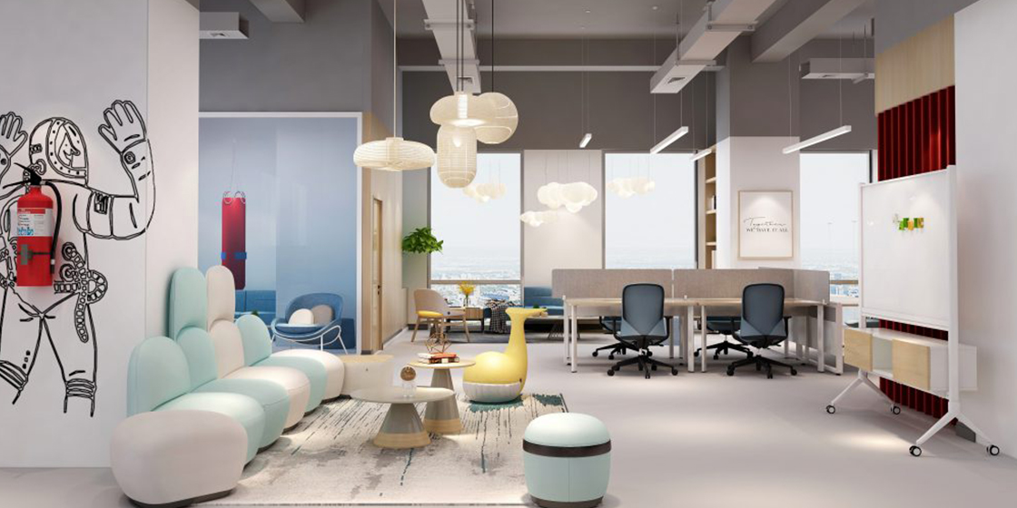
Sofa: D series, Chair: Aveza, Stool: Samu
What is Resimerical Design?
To put it simply, resimercial design focuses on making an office space feel homier and more comfortable. It's the amalgamation of various elements of commercial and residential design, hence the naming. The term resimerical started in the architectural engineering industry as a way of explaining the creation of a bridge from residential to commercial architecture. The rationale behind this concept is that more comfortable work environments tend to help workers relax and perform better. Blurring the lines between home and office is the very idea behind the resimercial design revolution.
The Evolution
Over a decade ago, a major shift began to take place in our workspaces. Companies turned to spaces with smaller footprints and, as workplaces shrank, they also opened up. The walls went away; the cubicles too. This drive toward purposeful spaces that were about quality, not quantity, was a major change for the modern office. But Millennials wanted more.
Driven by a desire to strike a proper work/life balance, Millennials began to look for design trends in home life that could be implemented in the office as well, leading to a blending of residential and commercial design and creating a whole new category: “Resimercial.” As millennials and Gen Zers are owning and dominating new young companies, they want different working environments that reflect the realities of their work lives.
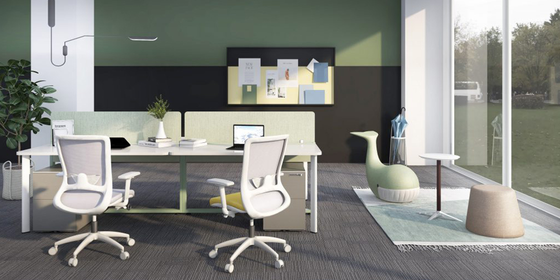
Chair: Winger, Desk: I-tech, Stool: Samu
Why is Resimercial Design important now?
It is not just another design trend. Given the current circumstances and changing behaviours of the employees, it is the next logical step in office design. Here's why?
Always-on work mode
Employees do not want to be limited to regular 9 to 5 schedules. Often, most millennials work hours which can be claimed are unconventional. The overall effect of the employee can be quite exhausting, and demotivating. More so, if he or she is stuck in an uncomfortable traditional desk that is unpleasant.
Varied roles and Varied tasks
Employees today do not perform one task, all day, every day. They are adept at performing multiple tasks, almost every day. Therefore, it is just natural to stay away from monotony. It is important to develop suitable spaces to correspond with the various tasks that they perform throughout the day.
Changing attitudes
Millennials who form the majority of the workforce today don't want to work with barriers in place. Building meaningful relationships with their co-workers is what employees today want out of their workplaces. Resimercial spaces cater to this change in professional behaviour much better than traditional offices.
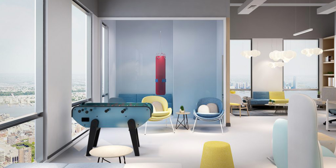
Sofa: U series
Benefits of Resimercial Design
If you look beyond the obvious aesthetic advantages of resimercial design, there are actually multiple benefits of opting for more relaxed workspace design. When we return back to work after working from home for over 6 months, we will want to find a similar comfort and relaxing spaces in our offices. Hence, Resimercial design is here to stay for the following reasons:
Happiness and Well-being
It is a great way to relax staff and make them feel more comfortable in their working environment. This will generate a workforce that is happier, healthier and more willing to participate in collaborative work and social interaction.
Better productivity
It is one way to boost worker morale and ensure a job well done. Nearly 80 per cent of creative professionals have their best ideas when working in flexible spaces. Creating a relaxed atmosphere through the addition of residential elements can decrease employee turnover, improve project focus, and ultimately boost an employers' bottom line.
Attracting and retain talent
According to a recent workplace survey, 48% of respondents said the design and layout of the guest area and the room in which they were interviewed would influence their decision to accept a job offer. A workspace that doesn't fit the way your staff prefer to work is one of the most common reasons employees leave. Creating an inviting office environment that improves retention can save your company a significant amount of time and money.
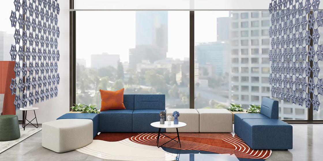
Sofa: Flower 6
What is a good resimercial design?
A good resimercial design concept involves incorporating key elements from our home environments and adapting them for the workplace, generally to make it feel more welcoming and inviting.
Textures and Finishes
Offices like most comfortable living rooms thrive on a bit of variety. Break up the monotony of the traditional office by incorporating different furniture textures and shapes into your corporate design or even replacing standard white/grey desks with textured-wood versions. This can go a long way in making your design feel more organic.
Biophilia
Natural elements and lighting can take a corporate space from harsh to comfortable faster than pretty much anything else. Try to incorporate touches of the outside world through natural finishes, large curtained windows, and classic house plants.
Soft touches
The very idea of this design is to feel like being at home. Incorporating a space furnished with couches, a coffee table, rug and some artwork can provide a relaxed gathering place where people can gather and talk openly. Comfortable lounge-like seating spaces, arranged in cosy nooks and spaces are perfect for downtime, relaxation, and informal meetings.
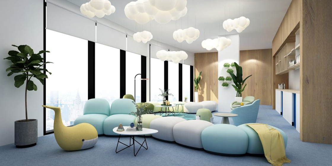
Sofa: D series
Flexibility
Spaces need to be multi-use, just like rooms in a home. Large spaces can be divided into smaller sections based on daily requirements by using movable partitions and opened up for large meetings or events with ease. Employees should have the choice to select a space for private tasks and group activities.
Color Schemes
An office colour scheme developed for a resimercial space may use a softer, warmer or more inviting colour palette. Pops of bright colour can add more personality to a workspace and can help define the characteristics of that business and its culture. It's important that bold colours are used with careful thought and expert guidance.
Cafeteria
Modern office lunchrooms are larger and feature long bench tables and seats or high tables and chairs or café-style tables, with lots of natural light, a coffee machine, a couch zone and colourful lamps. Providing a comfortable and inviting space for employees to eat together not only helps with team bonding, but it can also allow people to really relax and enjoy their break time and come back to their desks rested and recharged.
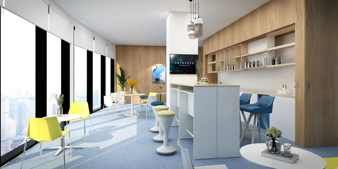
Chair: Batmann, Stool: Chessy, High table: Natural Joy
The Takeaway
Getting resimercial design right involves understanding that 'home' is a concept, not a place. Home can be a feeling and a state of mind. By using resimercial design elements in your workplace, you're not trying to recreate 'home' in an office. You're trying to recreate the state of mind we feel when we're feeling calm, happy and connected with our surroundings.
But the question is – do you really want your workspace to feel like your home?
There are arguments from both sides. However, most believe that the solution lies in a 'best of both worlds' kind of an approach that fosters creativity and helps businesses to accomplish their goals.